

Tick Tock... ok here is my 2nd assignment... not very impressed with it myself but I m still liking it since I'm amazed that I could have something like this from such a complicated clock haha...
ok the initial plan was to choose something extraordinary or something complicated so there will be alot of stages for the abstraction... so I decided to choose this clock over my KuKu bird clock since its alittle tough to draw with e bird stickin out n stuff... (ok tat jus didnt sound rite)
N when I drew this it was e nite before submission so I was cramming Singapore Society into my head n stuff n drawing this... so I'm sorry but tats why I was so sloppy for this assignment... I promise this wouldn't happen again... i mean this is a learning blog rite? haha ok so tat pretty much explains e huge jump from e 2nd -3rd sketch... I know its not a good excuse for it but its true...
eh basically e comments i received were pretty similar, 1) to put mroe emphasis on the pendulum cos tats wat distinguishes it from other kinds of clocks. 2) to make to progression smoother by adding more in between skecth 2-3. 3) some also mentioned to put e square face instead to give it a more grandfather clock feel.
All very good constructive suggestions for me so yea will try to improve further and make it work!
ok Ku Ku (Clock) Kern times out


 The critics for it were that the name 'KERN' was not obvious enough but overall it received pretty good feedback. Some suggested that i add the birds or leaves only on the branches forming my name. Although I didn't add the animals or leaves to ALL the letters, but i did incorporate the idea and added on some to make it seem more realistic. In this draft/sketch, i also added a swing in the picture to make it seem more lonely. The swing is to represent the loneliness of the guy waiting for his friend to return. And I'm going to use just black and white to show the despondence of being alone.
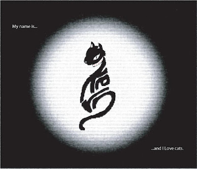
 Some of the critics I received are that the second cat i drew might look more like a 'I hate cat' than a 'I love cat' and the tail seemed awkward 'R' representing it. Thus i decided to further refine my cat in the first drawing and make it look more tamed, majestic and manly and use the letter 'N' as the tail instead in both drawings. Another comment was that the first few drafts of the first cat image, didn't look very much like a cat but maybe a rat or kangaroo. Thus i incorporated these comments and I'm most probably going to use the first cat and the tree drawings for the final refinements on adobe and photoshop.